Support and Resistance Aren't Lines
how to draw support and resistance in crypto
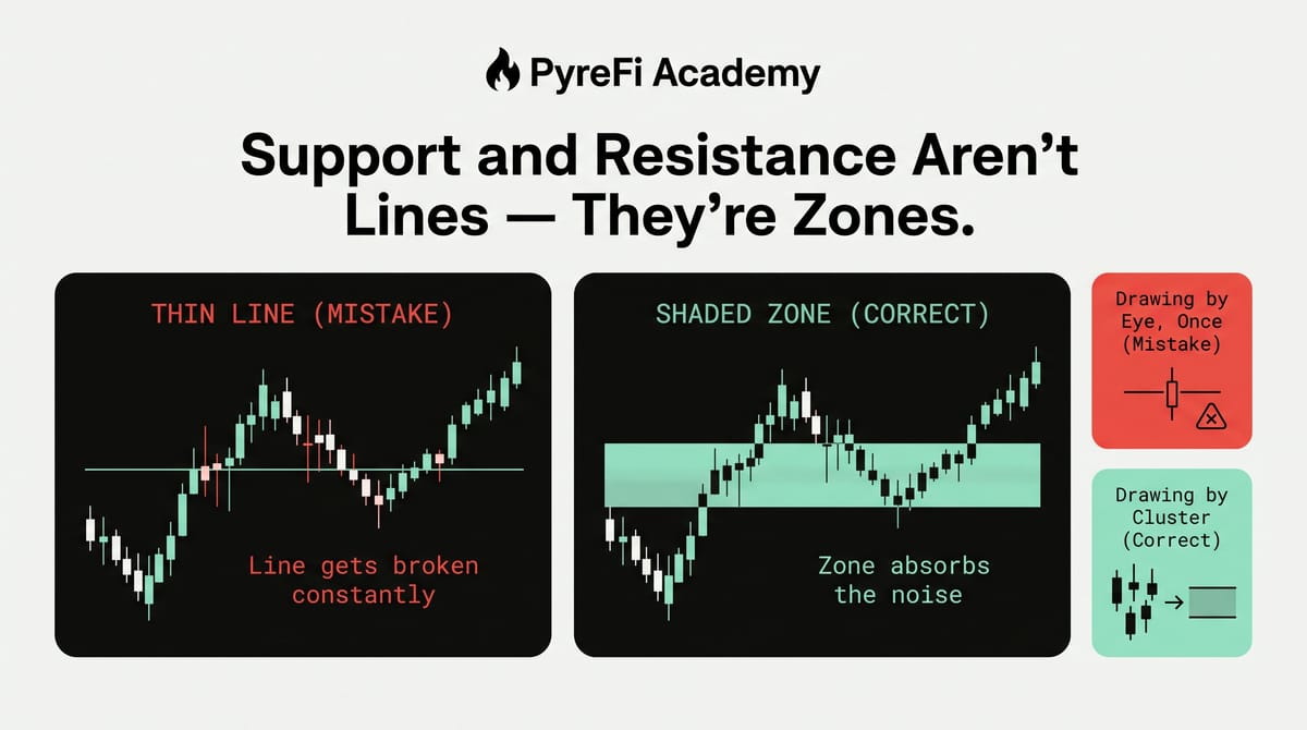
The single most common charting mistake — and the fix that makes your levels finally work.
If you've ever drawn a perfect support line, watched price slice straight through it, and then reverse two candles later — congratulations, you've discovered the most common mistake in technical analysis. The problem isn't your eyesight. It's that you drew a line when you should have drawn a zone.
Support and resistance are the foundation of nearly every trading strategy. Get them right and everything downstream — entries, stops, targets — gets easier. Get them wrong and you'll spend your career getting stopped out one tick before the reversal. Here's how to draw them properly.
Why a line is the wrong tool
A line is infinitely thin. Markets are not. Price is set by thousands of participants across multiple exchanges, each with slightly different order books, latency, and liquidity. The idea that all of them will collectively respect a level down to the exact dollar is a fantasy.
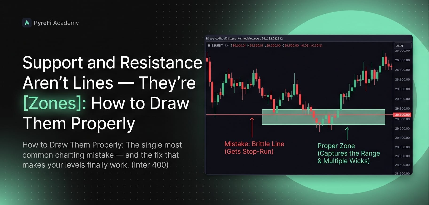
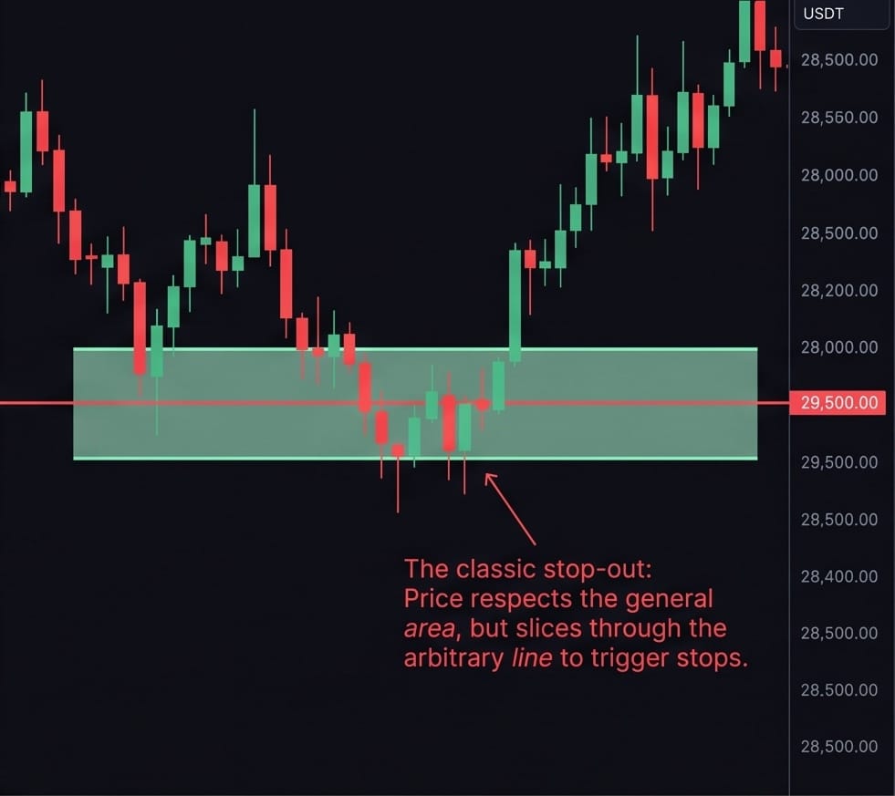
What actually happens is that a region of the chart attracts buying or selling interest. Sometimes price reverses a little above it, sometimes a little below, sometimes it pokes through and snaps back. Plotted as a single line, this looks like failure. Plotted as a zone, it looks like exactly what it is: an area of contested value.
The mental shift is simple but powerful. Stop asking "at what price will this reverse?" and start asking "in what range does this level live?"
How to build a zone the right way
A good zone is drawn from evidence, not hope. Here's the process.
1. Switch to a higher timeframe first. Zones drawn on the daily or 4-hour chart carry more weight than ones drawn on the 5-minute. More participants see them, so more participants act on them. Start high, then refine.
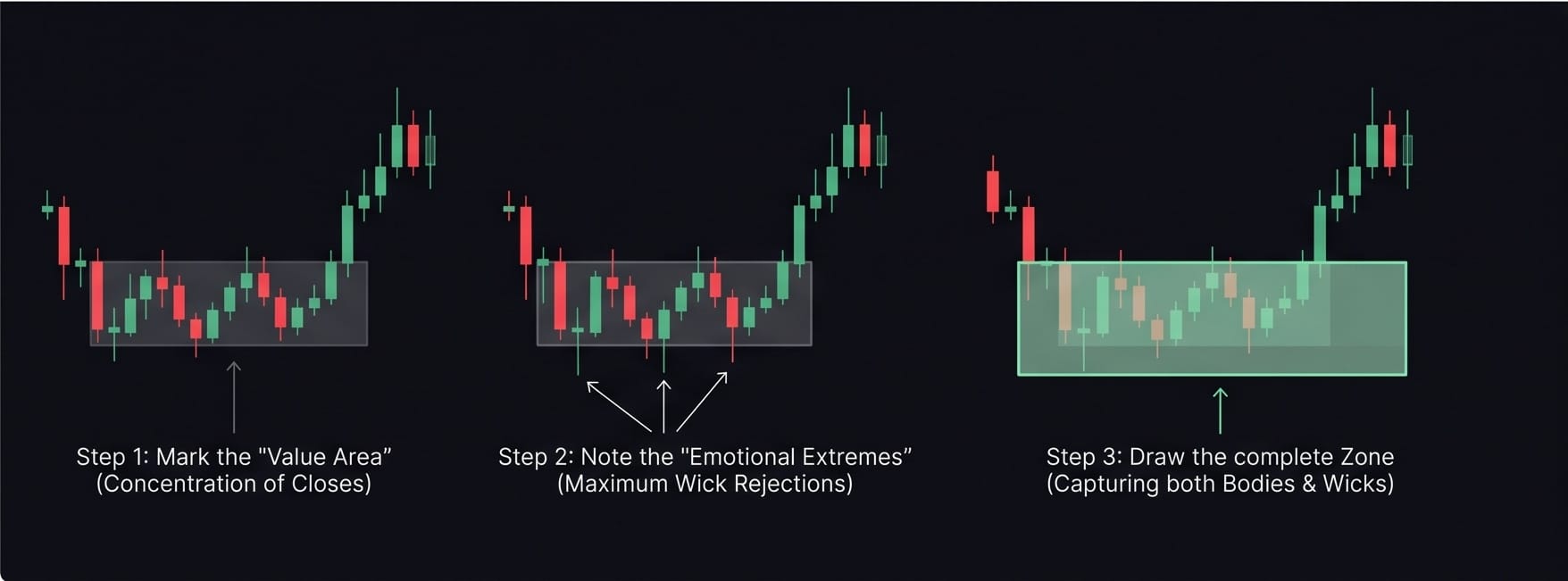
2. Find the cluster, not the extreme. Look for a price area where the chart reversed multiple times. Mark the wicks and the bodies. The zone stretches from where most of the candle bodies turned to where the wicks stabbed. That body-to-wick range is your zone.
3. Use both wicks and closes. Wicks show where price was rejected — the emotional extremes. Closes show where price settled — the agreed value. A strong zone respects both. The top and bottom of your box should encompass the meaningful wicks while being anchored by the closes.
4. Widen for volatility. A low-volatility, high-cap asset has tighter zones. A volatile small-cap needs wider ones — its "level" is genuinely fuzzier because its order book is thinner. Match the zone width to the asset's normal candle size, not to a fixed number of dollars.
The role of the "flip"
The most useful property of support and resistance is that they trade places. Old resistance, once broken and held, becomes support. Old support, once lost, becomes resistance. Traders call this a "flip" or "polarity change," and it's where some of the highest-probability setups live.
When you draw a zone, don't erase it the moment price breaks through. Instead, watch how price behaves on the retest. If a broken resistance zone gets retested from above and holds, that flip confirms the breakout was real — and gives you a clean, low-risk entry with a defined invalidation just below the zone.
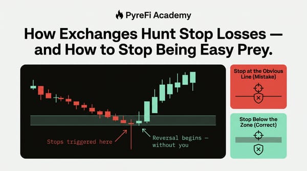
This is also why zones beat lines for risk management. A line gives you a single, brittle stop placement. A zone gives you a structure: enter as price reacts inside the zone, place your stop just beyond the far edge, and you've defined your risk against a region the market actually respects rather than an arbitrary point.
Common ways traders get zones wrong
Drawing too many. If every minor wiggle gets a zone, none of them mean anything. Restrict yourself to the levels that are obvious — the ones where price clearly turned more than once. If you have to squint to justify a zone, delete it.
Never updating them. Markets evolve. A zone that was hyper-relevant three months ago may be ancient history now. Refresh your chart regularly and let stale zones go.
Ignoring confluence. A zone is stronger when something else agrees with it — a moving average sitting inside it, a round psychological number, a high-volume node from the past. One piece of evidence is a guess; three pieces stacked in the same area is a level worth trading.
Forcing symmetry. Support and resistance don't have to be evenly spaced or the same width. Draw what the chart shows you, not what looks tidy.
Putting it together: a quick workflow
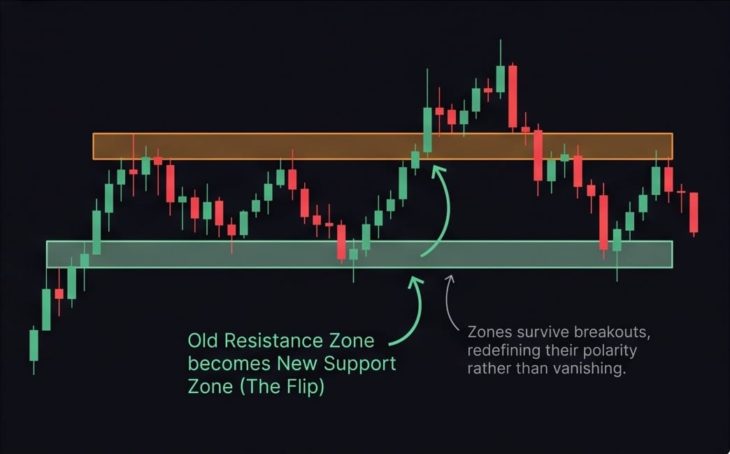
- Open the daily chart. Mark the two or three most obvious areas where price reversed repeatedly. Shade them as boxes, not lines.
- Drop to the 4-hour to refine the edges using recent wicks and closes.
- Note any confluence — moving averages, round numbers, prior high-volume areas.
- When price enters a zone, watch how it reacts before acting. A strong rejection candle inside the zone is your trigger; a decisive close through it is your invalidation.
- After a break, wait for the retest to confirm the flip before trusting the new level.
Why this matters more in crypto
In traditional markets, a stock trades on a handful of venues during set hours. Crypto trades 24/7 across dozens of exchanges simultaneously, each with its own order book and liquidity. That fragmentation makes precise, single-price levels even less reliable — the "price" you see is a blend of many venues that never perfectly agree. Zones absorb that noise. Lines shatter on it.
It's also why modern market-intelligence platforms increasingly reason in terms of ranges, liquidity clusters, and reaction areas rather than exact prices. When you aggregate the full market surface, the truth is always a zone — a region where interest concentrates — never a razor-thin line. Drawing your charts the same way brings your analysis closer to how the market actually behaves.
The takeaway
Support and resistance are among the first things every trader learns and among the last things most traders master. The upgrade from lines to zones is small in effort and enormous in results. It stops you from being stopped out by noise, gives you a real structure for risk, and aligns your chart with the messy, multi-venue reality of how crypto prices are actually set.
Draw the box. Respect the range. Let the market breathe inside your levels instead of demanding it hit a single perfect price. Your win rate — and your blood pressure — will thank you.
PyreFi watches the full tradable crypto market and reasons in liquidity zones and reaction areas, not brittle lines — the same principle, applied across every token at once.